Monday, 19 December 2011

Painting at work...

Frequently I am asked at work to do some maintenance and painting after the kids have finished on rides and just before it starts to get dark. Previously I have repaired, sanded and painted the top of the bandstand at The Worthing Lido. Last year I also painted a fruit bowl upon the top of the roof. I have been carrying on with the second every so often. The photograph below shows my progress do far.

The second fruit bowl on the East side nearing completion.
The other day I was asked to complete an fill in the worthing motto in Latin. It had been displayed as part of the emblem on a side wall facing the pier. It has also been painted before but parts had come off, so i was asked to go over it as best as I could. As soon as I looked at the wall I could see that It had been rushed previously and hence lettering was wrong in the style of Times New Roman. I got to work and just had to make do with what was there.

Just before finishing the last word in Latin I saw a man looking over me, and approached me by saying; "You do know you have done the letters wrong". I knew exactly what he meant. The previous person had done the letters such as "X" and "M" with the bold line first and the thin line second. (It's a bit hard to explain)

Anyway I had an inspirational ten minute talk with this guy about calligraphy and graphic design. He asked me whether I was a professional and I told him that I was still in education and planning to go to university next year. He recommended looking at SCAT, Somerset College of Arts and Technology as that was where he went when he was younger. I expect this bloke was retired now. 

From carrying on talking personal he kept asking me questions if I had heard of Company's such as WPP, a leading advertising and marketing service that he used to work for. I was fascinated and truly inspired by his words. This guy next went on to say that his last piece of work he was commissioned for was a font for a bottle. He went on to tell me that he was the guy who created the label font for San Miguel and Cobra beers.

I had loved talking to this bloke and could have talked to him for hours. Sadly he had to go because his wife was waiting for him. He shock my hand and told me his name was Bob. A fascinating day and I was astonished how successful he had been.
Brighton Photo Fringe Open'11

I went to see the penultimate day of the Brighton Photo Fringe Open'11 exhibition at the Phoenix Gallery. It was on from 19th November to 18th December and I thought It would be a good idea to go along before it ended. The exhibition brought together a diverse group of artists to explore different perspectives on critical issues emerging from contemporary photographic practice.

The exhibition space was very small in itself however there was a vast amount of space to view the artists work. I had never came to this exhibition before but it really caught my eye to want to come back again. The space was very clean and open. The various rooms built into a walkthrough contained different types of imagery, from photographic sculpture to illusional pieces.

The first lot of work I saw was by Alexander Nicholas Gehring; an interesting approach to photography using only the shades black and red. They were all created from C-Prints in 2011 and consisted of very bold and contracting streaks of red light upon a dark room or background. They were certainly my favorite pieces of work in the gallery.


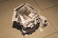
The next section of the Open'11 Gallery contained three A0 photographs and a pile of A4 sheets of paper. From looking at the photographs I could see that they were very pixilated and included a lot of noise distortion. Later I found out that they had been printed on Xerox paper. This meant that they would have been cheaply produced and for some specific reason. I personally really liked them because they were not sharp in the slightest, they almost conveyed lovely texture.

There were also several other places within the exhibition space that I looked and viewed. There was one section that did not involve photographs but objects, i don't know whether this was part of the Brighton Photo Fringe gallery but i found it interesting. It contained a brief description and some "Practical Electronics". I had done an A level in Electronics so I was quite amazed to see a series of old equipment. 

I had a great time looking around and wanted to come back again somewhen. I was going to head of to a "New Art Exhibition" by the famous Ronnie Wood, but when I got there I had run out of time and it had already shut. That exhibition was in one of the shops in the lanes but also ended over the weekend.

"Gathering" at Fabrica 16th November 2011

As I was in Brighton and heading back to the station, I thought it would be a good idea to quickly look what was happening at Fabrica. I walked in to find a huge two sided screen of which one side was blank. It seemed to play a movie that was created by Melanie Manchot called "Gathering". The artist was both interested in incidents that examined collective identities, codes and behaviours in public space. Melanie wanted to examined mass democratic expression to parade and protest that swept across Europe and the Middle East from anti cuts protests in the UK to the Arab Spring.

I sat down in the dark with a huge projection infront of me.It took a long time to try and understand what the film was all about. The first was called "Walk Square 2011" and focused upon 1000 kids and 13 schools all gathering in one area of space. The key area seemed to be a huge "Gathering" somewhere where public would be able to see them. I believe It was set in Hamburg. 

The first film clip "Walk (Square)" showing from far away onto the crowd.
Everyone was rotating in a circle. The camera angle was very far away and gave an unusual touch to me because you could hear the sound of the crowd as if you were standing in the centre of the circle. Suddenly the sound drops to silence and the camera view starts to pan around from the perspective of the middle of the circle. Soon after the sound picked up and everyone had smiles upon their faces as they start to walk round in a square. I was very confused by the next action because the kids disperse and a line of different sized rectangles appears upon the ground. It looked as if everyone has a piece of chalk to hand. It was as if the power of a human action when directed was put towards a common goal. 

I was then asked to move round to the other side of the wall to see a different projection. This second film was entitled "Celebration (Cyprus Street)". It was inspired by traditional street parties in London's East End, developed over a period of six months with residents. It was commissioned by Film and Video Umbrella and supported by Arts Council England.

It was filmed by a single tracking shot, capturing the rich diversity of the East End following four centuries of immigration. The sound starts to get louder as conversation grows throughout the street, no one is noticing the camera action. At this point it made me realize that both films seemed to be in contrast with each other. The first film was about leading as there was a person showing people where to go; and this short clip was about following others and their actions. There was also no seats compared to before. I noticed that everyone suddenly stopped and the street start to turn around to have a picture taken. I was given a strong sense of insecurity with the fact with such a life sized amount of people were all looking at you as if you were about to do something big. I had to leave the room.

Soon after I was asked to fill in a short questionnaire and I was handed a leaflet. I soon found out that Both of Melanie's work had been showcased internationally, with solo presentations at Haus am Waldsee in Berlin, Manchester and various other places. I was fascinated and really enjoyed seeing her work. I was amazed my peoples reactions around me and I was intrigued to how she managed to direct so many people together.

Wednesday, 7 December 2011

What Northbrook Has To Offer (Part 2)

This is my long awaited second part of one of my blogs about Northbrook College and the BA (Hons) courses that I could if I wish apply for. In this blog post I thought I would spend a moment to talk about a degree run at West Durrington campus called Contemporary Photographic Arts. 

On Friday 4th November I left class early to attend an open day with David in Fine Art. After this I thought it would be a good idea to wait around for half an hour and go and look at this photography degree. I thought that I should check out what Northbrook had to offer because if it felt right it meant that I would not have to spend as much money moving away from home.

I was a little disappointed to find out that I was the only person in the open day talk who had actually turned up. Nevertheless It meant that I could talk informally on a one to one basis with Paul Grivell, the course tutor. This meant the course talk was a lot less time than the previous. When I stepped in the room I realised I had been there before and then remembered last year I went to the same talk because I wasn't really sure which course to choose here at the college.

From Paul skipping through the slideshow, the overview of the course seemed to be bringing critical theory and contemporary photographic practice together in order to challenge and question photography as a whole. I thought this sounded quite interested and I was given a leaflet with all the basic course information. Here I found that the Photographic degree would be very broad, working with digital and analogue techniques using photography and moving image meant there would be a wide range of forms to play with.

The course had been split into three years and covered much of the same outline as the Fine Art degree. The first year would be a lot of research and written presentations as well as an exploratory stage at the beginning of the year. This meant that in the first month you would be able to play around and document findings from using various mediums. The theme would be set and you would wok from it. For the second year you would advance on these skills and ending the year you would showcase your work in a public exhibition or space. A few examples were shown on the slideshow of people hiring out a shop window to create a 24 hour exhibition; others did the same with a car parking space. In the final year students were expected to know what area they wanted to work and things start to become more specific. All work and exhibition space was up to you, the student could set their own theme based upon their genre of work.

Paul talked about his own individual work and I thought this was good. If I was going to do a degree in a subject I want to see that the tutors themselves have a passion for the subject, as well as having interests outside of just teaching. At the end of the three years I was told that many of the undergraduates went to be free lance or pursue within their medium as well as some completing a masters. The entry requirements were stated as 160 UCAS points. I thought this was possibly quite low, nevertheless It meant that because of being educated in the same college I could quite easily get onto this course. This was an option.

To conclude this Photographic Art degree, I would say that It was a great course in general. The facilities were actually quite a lot better than I originally thought they would be. I underestimated this course so much that much of the equipment and studio space was actaully better than other university visits I have been to. I loved the fact that only a hand few of students could get onto this course; a maximum of 15. This was great news in my eyes because it would mean that you would get a lot more support and acknowledgement from tutors, instead of being one in the sea compared to being one of 300 in Brighton. The only downside that I had with this course nevertheless was that I didn't think it was in the prime location. If this course would have been in london or a big city I would certainly go for it. I also felt that even though I loved the teaching staff at Northbrook College I felt It would be time to move on from Worthing. This could be a safe or a last resort if I do not have a fourth or fifth choice on my UCAS application.

Friday, 18 November 2011

How To Resize An Image In Photoshop CS5 And Upload It To The Web

Because I did not attend the Creative Quarter in London, I had to go to college and do a session with Claire. We were based in the computer room behind CJ's FLA and were told to bring sketchbooks and photographs to prepare for our digital portfolio. It was a really good few hours where we spent time resizing images to upload to the internet and shown how to use the printers. I learnt a lot and thought It would be a good idea to put the process on my blog so I can remember for later references.

1. First find the image you wish to resize and make smaller to upload to the Internet. Right click on the image and highlight "Open with" and select "Adobe Photoshop CS5"


2. A new Photoshop window will appear with the selected digital photograph on canvas. To start resizing go to "Image" and click on "Image Size". A box will pop up.


3. You will then need to change the pixel dimension to "Percentage" from the small drop down menu as shown. Change the top box to 50 and the bottom box will follow. This means you are halving the photograph. Hence it now saying 50 percent. Click OK when complete.


4. The box will vanish and you photograph on canvas will appear smaller. Next you need to select "File" on the top left of the toolbar, and scroll down to "Save for web & devices". Click and another box will appear.


5. Select "4 up" at the top toolbar of the new box. You will then need to manually do the next step. Start to zoom in by selecting the preferred distance to capture distortion from the bottom left corner. Move around the image by dragging and finding a good bit of detail. You should then try and create an image that is similar to the "Original" shown on the top left. The other three images are there to compare to each other. Change the quality of them by selecting JPEG or GIFF near the top. You can then play around with the compression quality situated below. It is best to use a JPEG file and try to keep the image size below 2MB to upload to the internet. Once you are happy with the comparisons click Save and select a destination. You are now ready to upload this digital photograph to the web.


Portfolio Preparations


Today I was learning at college how to upload a digital file to the internet and my blog. I was taught how to resize an image in preparation for when I have to do an online portfolio after applying to my chosen universities.

An image captured using my digital Canon 500D SLR camera. I took this photograph looking up a wool jumper whilst it was hanging on the washing line. I love the bold vibrant colours and the abstract patterns created. I am impressed by the outcome because it has not been edited in anyway; the sunlight from the outside of the jumper made it perfect. I possibly conclude using this photograph as part of my online portfolio for universities as it is an unusual way to create art, and could be considered as mixed media from a photographic aspect as well as an instillation piece.

Tuesday, 15 November 2011

What Northbrook Has To Offer (Part 1)

After leaving class early on Friday 4th November from the last day of the life drawing week I felt I needed to consider my UCAS options. Therefore I felt it was just as important to check out BA (Hons) courses on my doorstep as well as other courses throughout the country.

I hadn't completely made up my mind at the time what area I wanted to specialize in next year. I wanted to make the correct decision. I had been looking at all courses of interest at other universities; such as art and photography. I was considering trying to do a broad degree that I could use both elements upon, a course that wasn't too specific in the area chosen.

I left the main studios at roughly 12:55 on a mission to aim at finding the fine art talk room for 1:00pm. Surprisingly there were a considerate amount of people, few of which were late comers from our art, design & media course. 

The courseleader, David Blackaller, gave us a brief undertsading of what it was like to be a student studying at degree level in Northbrook. He mentioned that the fine art course was very broad based and you could quite easily take a non medium specific approach to things. The course provides flexible working areas and a wide range of media could be used. Some examples of these were sculpture, drawing, photography, painting and printing etc. This sounded brilliant to me; not having to stick in a dedicated allocation of an area. This meant  that I could also be able to possibly work and get ideas and inspiration from others and apply to a different medium. The main reason why I had not jet chosen a narrower area was because I felt I hadn't yet had enough time to relate to other areas of working such as textiles and sculpture.

As well as having a fine art BA (Hons) course at Northbrook, you could also choose another three sections within this space. These being painting, sculpture and printmaking. I felt I would have gone for the broadest section as I didn't feel I had enough knowledge of the others. 

The structure of the course seemed very similar to what we had been completeing at this current moment. The first year involved a few weeks of fine art workshops, of which you would be going into more deatil in this specific section. Then there would then be two studio practise briefs as well as lectures on cultural and supporting studies. The second year was also very similar and we were told by the beginning of this year which study you were most interested in and start carrying this forward. By the third year you would be creating and setting your own briefs as well as creating a dissertation.

I was told that students from previous years had exceeded in this course and had gone to places such as Central St Martins and Glasgow School of Art to study their masters. Other progression paths that were mentioned by David were found employment in museum work, teaching and freelance. 

I was also very interested in how to apply. After asking David he mentioned that you apply the same way as other universities around the country by apply via UCAS. You needed 160 UCAS points from A Levels or A BTEC diploma. I was surprised by this because I considered it to be a low entry requirement and hence not being very good. I  now realise that possibly I may have underestimated Northbrook at degree level as many of the other universities even with high UCAS points to get in relate getting in pretty much strictly to your portfolio evidence. I was happy with the fact that at Northbrook you got the chance to have a face to face interview.

To conclude this fine art course I sum it up by saying it would be the perfect course for me. The only major flaw I feel against this course nevertheless is the fact that it is not what I consider to have huge connections in this area. There would not be as many places to exhibit and it would be harder to make a name for yourself. A perfect place for me to study would happen to be in Brighton, London or Edinburgh. This is because all cities are influenced by the creative scene and there are lots of links. I feel Northbrook may not have so many. Even though I love the structure and the teaching style I think this gives it away. If this course was in London I would be applying to it next year.